Guest Writer Wednesday: Journey 2 Posters: Painfully Obvious Sexism Watch

This is a guest post from Scott Mendelson. Originally published at Mendelson’s Memos.
One of these Journey 2 posters is not like the other. Hint, it’s the one with giant boobs that are more important than giant bees.
Here are four character posters (and one main poster) for Warner Bros’ upcoming Journey 2: The Mysterious Island. Each poster highlights a lead character and a respective giant animal menace. As you can clearly see, the focus point of three of the posters is the actual special effects creation that is chasing our heroes. In three of the posters, the human character is smaller than the monsters, thus making the giant animals themselves the center of our attention.
Of course, the middle poster in the top row, the one highlighting Vanessa Hudgens is a bit different. In her poster, the flying bee creature is smaller than Hudgens’s profile. So if the giant bee is not the center of attention, if it isn’t the fx monster in this poster, than what is?
Why, Hudgens’s boobs of course. As you can see, the largest thing on the poster, the thing that is clearly intended to be the focus point for Hudgens’s poster is the young actress’s rack.
The marketing team at Warner Bros. didn’t see fit to fetishize Dwayne Johnson’s massive muscles or any manly attributes that Josh Hutcherson may possess. But in her character poster (and the main poster on the bottom right), the young actress’s breasts are apparently the main attraction.

Because of course when you’re a girl in a generic or male-driven mainstream genre film, even when it’s a PG-rated adventure aimed at younger kids, the only marketable attributes you have is your ‘fuck-ability’. Stay classy, Warner.


Scott Mendelson is, by hobby, a freelance film critic/pundit who specializes in box office analysis. He blogs primarily at Mendelson’s Memos while syndicating at The Huffington Post and Valley Scene Magazine. He lives in Woodland Hills, CA with his wife and two young kids where he works in a field totally unrelated to his BA in Film Theory/Criticism from Wright State University.

From the Archive: Disembodied Women: Take Five

This post previously appeared at Bitch Flicks on January 12, 2011.

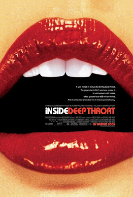
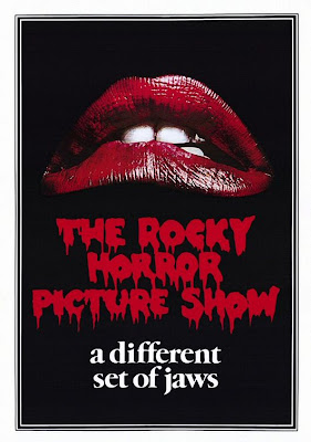
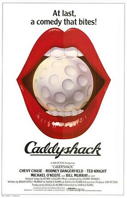
According to the following posters, women have bright red mouths.  Wide open mouths with perfect white teeth.  That they can put things inside of.  See, women often have objects inside their bright red mouths, like golf balls or strawberries, that they’re usually biting.  And if they aren’t visibly biting anything, it’s implied that they’ve recently bitten something, what with them all sexy-licking the dripping blood off their–in case you forgot–bright red mouths.  Or maybe they’re just biting their own mouths.  Or maybe their mouths actually become food (bright red food, even). But if they aren’t biting anything, then the least those bright red mouths can do is stay silent.  In fact, looking at the posters in succession, one could even argue that all those bright red mouths (oh yeah, and the completely erased mouths) represent the silencing of women.  Who can talk while wearing an implied ball gag?  Or while eating?  Or when you don’t have a mouth?  Or when your mouth is, you know, really just a pair of red chili peppers?  Or if you’ve got a bloody knife pressed against it? Or if that shit is zipped shut?

As discussed in the other parts of this series, separating women from their body parts in media images subtly reinforces women’s status as commodities, or pleasure-objects, or victims, who aren’t valued as whole, and who are, as a result, denied their humanity.  And we all know, because we live in This Society and it’s 100% inescapable, that the representation of women’s mouths is all kinds of tied up in the mouth-as-vagina metaphor–with the accompanying requisite phallic cigarette and lipstick images apparently never getting old. (And I’d be thrilled to never have to hear the phrase “dick-sucking lips” ever. again.)  But if the mouth isn’t a vagina, then it’s a nonstop, life-ruining motormouth (ever hear someone call a man a motormouth?) that even Mr. Potato Head wants to slap the shit out of. (If you don’t know what I’m talking about, have a look at the Mr. and Mrs. Potato Head commercial that ran during the Superbowl.)  
I guess I shouldn’t be surprised.  Molly Ringwald putting her lipstick on with her cleavage in The Breakfast Club is one of the most famous scenes in all of 80s film.  We’ve come a long way, baby!

Top 10 of 2011: Seriously? These Are the 40 Greatest Movie Posters?

Back in April of last year, Stephanie Rogers took issue with the way women are discussed in Total Film‘s selection of the “best” movie posters. Not only are women rarely present in the posters, but when they are featured…well, we’ll let you read what she had to say.
Here’s #7 of 2011.
_______
Look, it’s not like I want to keep sending traffic to the Total Film site. Especially after they treated us to their list of the 100 Greatest Female Characters. But last Wednesday, they published another list of greatness, this one involving movie posters. Well, I love movie posters, and I understand that my Greatest Ever list won’t match Amber’s Greatest Ever list, or anyone else’s Greatest Ever list, and that one’s reaction to and appreciation of all forms of art is subjective and often deeply personal. So I’m not here to discuss whether these are, in fact, the 40 Greatest Movie Posters. I’m here to talk about how Total Film talks about the posters that feature women.
[…]
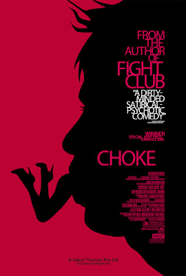
I take it back. I am going to talk about the offensiveness of these shitty selections. Out of the nineteen posters above–and that’s nineteen out of Total Film‘s forty that actually contain some semblance of a woman’s image–most either sexually objectify the woman or show her getting attacked. Or she’s dead or dismembered. I mean fuck, out of Total Film’s list of 40 Greatest Movie Posters, Bitch Flicks has previously criticized the posters of American Beauty, Choke, The Silence of the Lambs, and Secretary for showcasing dismembered women. That’s bad enough. But the way the Total Film writer, George Wales, talks about the women/characters in these posters is just … problematic at best.

Poster Analysis: Summer Movie Preview

We all know that summer is the worst season for movies. It’s when the heat melts all of our feeble brains into mush and we’re only capable of grunting approval at explosions, special effects, scantily clad women, and the most simplistic plots, while sitting in icily air-conditioned theatres and shoveling $7 bags of popcorn into our face holes. Here’s a sampling of films opening in wide release that we have to look forward to, now that summer has officially begun.


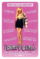
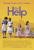
In these posters I see a “maneater,” a teacher who is bad at her job, a “dirty girl,” some arm candy, black maids, almost up a Disney princess’ dress, a scooter passenger, and an invitation to ,ahem, a hole. The Debt offers the only poster with not one, but two women showing agency. One Day might be interesting, as we see Anne Hathaway’s pleasured expression while kissing a man. The Help could possibly be progressive, since it at least shows the black women in the more active, central position. Maybe.
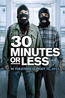
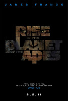
In these posters I also see a bunch of white dudes who win battles: Harry Potter, Conan, Captain America, and that guy from Transformers. I see male-driven comedies (Horrible Bosses, 30 Minutes or Less, Change Up). I see one “idiot,” although it seems “our” in the title might refer to women. I see machines. And those damn dirty apes are back.
As we’ve pointed out in other Poster Analysis pieces (often in the comments), the way a film is marketed can have very little to do with the actual content of the film. But by choosing to market films in a way that presents women as passive or as objects for male admiration, or that excludes them completely, production companies tend to reveal internal biases and expectations, and who their target audience actually is.
What do you think of this year’s crop of summer movie posters? (I am actually happy to see the Transformers babe fully clothed.) Did I leave out any movies on your radar? Finally, what movies do you plan to see in the theatre this summer?

Seriously? These Are the 40 Greatest Movie Posters?

Look, it’s not like I want to keep sending traffic to the Total Film site. Especially after they treated us to their list of the 100 Greatest Female Characters. But last Wednesday, they published another list of greatness, this one involving movie posters. Well, I love movie posters, and I understand that my Greatest Ever list won’t match Amber’s Greatest Ever list, or anyone else’s Greatest Ever list, and that one’s reaction to and appreciation of all forms of art is subjective and often deeply personal. So I’m not here to discuss whether these are, in fact, the 40 Greatest Movie Posters. I’m here to talk about how Total Film talks about the posters that feature women. (I’m using the word “feature” here loosely, as most of the posters that dare include a woman often objectify, obscure, and/or dismember her.) Feel free to look at their list of all 40 posters, but I’m including only the posters that “feature” women below.
  
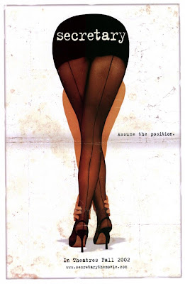
I take it back. I am going to talk about the offensiveness of these shitty selections. Out of the nineteen posters above–and that’s nineteen out of Total Film’s forty that actually contain some semblance of a woman’s image–most either sexually objectify the woman or show her getting attacked. Or she’s dead or dismembered. I mean fuck, out of Total Film’s list of 40 Greatest Movie Posters, Bitch Flicks has previously criticized the posters of American Beauty, Choke, The Silence of the Lambs, and Secretary for showcasing dismembered women. That’s bad enough. But the way the Total Film writer, George Wales, talks about the women/characters in these posters is just … problematic at best. 
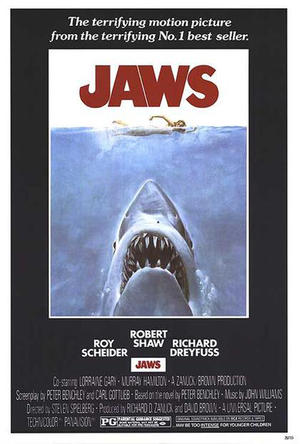
Jaws: “Nubile young swimmer versus hungry giant shark. We know who our money’s on …” Um, nubile? Really? 
Rosemary’s Baby: “They should stick one on the wall of every Boots. Sales of contraception would skyrocket!” Why even bother selling contraception anymore? Just force doctors to make every girl, immediately when she begins menstruating, sit in an an empty room alone with this poster. I’m sure we can get some legislation passed on that if we just casually mention it to a nearby Republican.
The Silence of the Lambs: “The presence of the moth over the girl’s mouth …” The girl’s mouth? She’s not five.
Pulp Fiction: “Uma Thurman practices her best come-to-bed expression …” Is that what she’s doing? Practicing? That’s a thing she sits around practicing? Like learning to play an instrument? 
Secretary: “Okay, so it’s more than a little pervy, but given the subject matter, that’s probably fairly appropriate. And there’s a wonderful symmetry to the image … oh who are we kidding?” I don’t even know what this means. What’s pervy? The poster? The film’s exploration of fetish and S & M? The writer of this article?
Hard Candy: “Every parent should mount one of these in their child’s bedroom to ward off sexual predators …” Look, George Wales. You can’t tell from the poster that this is a film about sexual predators. And even if you could, you’re basically implying that it’s the responsibility of the victim to ward off a potential attack. A child has no responsibility in warding off sexual predators, okay? A child abducted and abused by a sexual predator is a victim of kidnapping and sexual abuse. End. Of. Story.
Brick: “The more hard-boiled elements aren’t on display, but the amount of fragile beauty conjured up by a single wrist is most impressive.” Yeah, when I look at a dead woman’s hand floating in the water, I’m all, “OMG the gorgeous subtlety of a woman’s probable murder.” 
Being John Malkovich: “Cameron Diaz’s make-under is also on full display.” Because that’s important to note. 
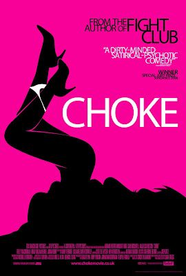
Choke: “It certainly captures the off-kilter mood, although we must clarify that Sam Rockwell doesn’t actually eat any women in the film.” He doesn’t?!! What a misleading rip-off. Reminds me of the title of an article I just read at Total Film called, “The 40 Greatest Movie Posters.” 

Disembodied Women Take Five: Mouthing Off

According to the following posters, women have bright red mouths.  Wide open mouths with perfect white teeth.  That they can put things inside of.  See, women often have objects inside their bright red mouths, like golf balls or strawberries, that they’re usually biting.  And if they aren’t visibly biting anything, it’s implied that they’ve recently bitten something, what with them all sexy-licking the dripping blood off their–in case you forgot–bright red mouths.  Or maybe they’re just biting their own mouths.  Or maybe their mouths actually become food (bright red food, even). But if they aren’t biting anything, then the least those bright red mouths can do is stay silent.  In fact, looking at the posters in succession, one could even argue that all those bright red mouths (oh yeah, and the completely erased mouths) represent the silencing of women.  Who can talk while wearing an implied ball gag?  Or while eating?  Or when you don’t have a mouth?  Or when your mouth is, you know, really just a pair of red chili peppers?  Or if you’ve got a bloody knife pressed against it? Or if that shit is zipped shut?

 
As discussed in the other parts of this series, separating women from their body parts in media images subtly reinforces women’s status as commodities, or pleasure-objects, or victims, who aren’t valued as whole, and who are, as a result, denied their humanity.  And we all know, because we live in This Society and it’s 100% inescapable, that the representation of women’s mouths is all kinds of tied up in the mouth-as-vagina metaphor–with the accompanying requisite phallic cigarette and lipstick images apparently never getting old. (And I’d be thrilled to never have to hear the phrase “dick-sucking lips” ever. again.)  But if the mouth isn’t a vagina, then it’s a nonstop, life-ruining motormouth (ever hear someone call a man a motormouth?) that even Mr. Potato Head wants to slap the shit out of. (If you don’t know what I’m talking about, have a look at the Mr. and Mrs. Potato Head commercial that ran during the Superbowl.)  
I guess I shouldn’t be surprised.  Molly Ringwald putting her lipstick on with her cleavage in The Breakfast Club is one of the most famous scenes in all of 80s film.  We’ve come a long way, baby!

Disembodied Women Take Four: … Look Closer

The first installments of Disembodied Women focused on film posters that use close-ups of women’s backsides and bare legs to promote movies, and one that illustrated the removal of the woman’s head entirely. This post gives examples of film advertising that uses women’s airbrushed stomachs, and in several instances, divorces pregnant women from the rest of their bodies. (Because we all know, once a women becomes pregnant, she ceases to exist.)

As if reducing women to a collection of nothing more than unrealistically portrayed body parts weren’t enough, the accompanying taglines of these particular film posters also caught my attention.

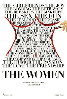
The Women and 27 Dresses don’t use a catchy tagline on the posters shown below. Maybe the designers of the posters felt that random words shaped into a woman’s torso would suffice, considering these two films exclusively target women audiences. And what do audiences comprised of women want to see in The Women? Nouns, apparently: Bonding Joy Jealous Kids Tears Struggles Laughter Thighs Balance Intuition Fighters Passion Elegance Shoes …

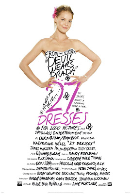
With the 27 Dresses poster, what else could we possibly need? She’s already been made into a fucking dress. (Get it? The movie is called 27 Dresses, so Katherine Heigl’s body is like totally a dress. Neat! Way to objectify a woman by turning her into an actual object.)

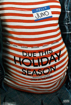
Juno’s “Due this holiday season” is the least offensive of the remaining taglines, again because the advertisers perceive no marketing bonus in sexualizing her … she’s a cute little indie hipster weirdo. Still, the fact that the poster emphasizes the pregnancy, rather than the woman who’s actually pregnant (except for the nametag, ha), sends the message that the pregnant woman is no longer as important as Her Pregnancy. (Think Hollywood starlets and the constant Baby Bump Watch.)

The other two posters depicting a pregnant woman each emphasize two men, the first one showing two men in a photo, and the other showing two men smiling ridiculously while cradling the woman’s stomach. Also note the … what, shaving cream smiley face? … painted on her stomach.

Then the taglines.

In Misconceptions, we get: “Good things come in other people’s packages.” Um, okay. Whose “package” are they referring to here exactly? The woman-as-baby-making-machine who will deliver a package in nine months? Or one of the two men apparently involved in providing sperm? With his … package? What the hell is happening here.

In the poster for The Brothers Solomon, they just come out and say it: “They want to put a baby in you.” Great! A film about a woman’s pregnancy that’s actually somehow about two men. Thanks, Hollywood.

The remaining posters that incorporate taglines:

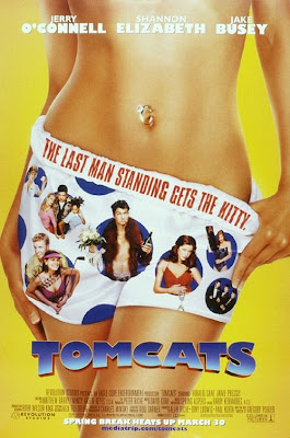
Tomcats: “The last man standing gets the kitty.”

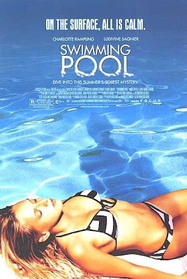
Swimming Pool: “On the surface, all is calm.”

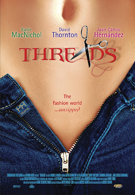
Threads: “The fashion world … unzipped.”

American Beauty: ” … look closer”

The Babysitters: “These girls mean business.”

A couple of them might not be so terrible if they weren’t accompanied by the image of a woman’s bare stomach. But since they are, what differentiates the descriptions of these Hollywood films from the descriptions of soft-core porn?

Disembodied Women Take Three: Leggy Perfection

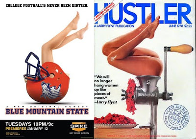
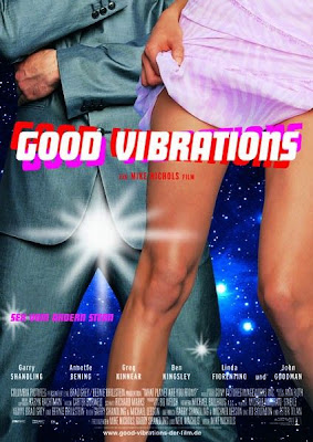
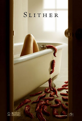
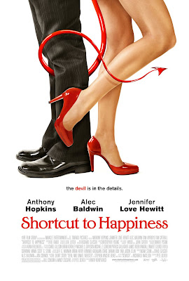
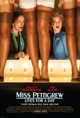
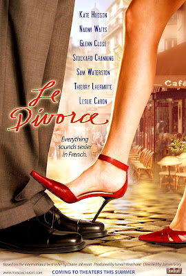
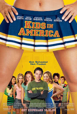
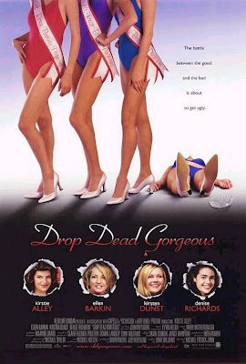
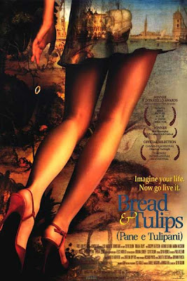
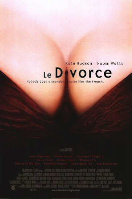
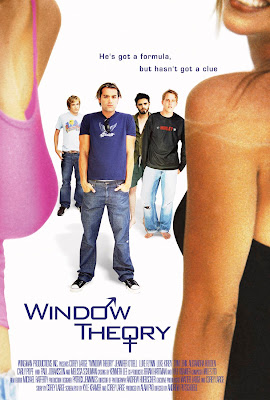
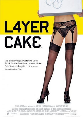
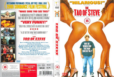
In 1978, Hustler magazine depicted a headless woman shoved into a meat grinder on their June cover. Thirty two years later, Spike TV chose virtually the same image to promote their television show Blue Mountain State. Also, note the poster image for the film Choke, pictured below. This installment of “Disembodied Women” focuses on the continued use of dismemberment, in this case exposing women’s bare legs, to advertise films. The posters vary considerably, promoting horror films and romantic comedies, as well as foreign films and period pieces. The problem with such advertisements, as media activist Jean Kilbourne argues in her book Can’t Buy My Love: How Advertising Changes the Way We Think and Feel, is that this perpetual sexual objectification of women encourages men to think of women as inferior. Additionally, women begin to view themselves as a collection of body parts, where a perceived flaw in only one area of the body leads to an obsessive desire to perfect the whole. For more disturbing evidence, check out our first and second installments, The Rear View and The Headless Woman, and feel free to add to our growing list of offending films in the comments section.
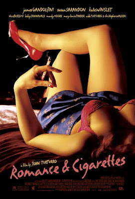
Disembodied Women Take Two: The Headless Woman

The Headless Woman is the second installment in our Disembodied Women series, where we illustrate how production companies continue to market films through the dismemberment and objectification of women’s bodies. For more, see our first post, The Rear View.

Disembodied Women Take One: The Rear View

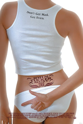
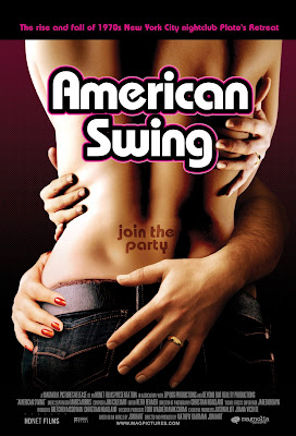
You see it constantly in print advertising and commercials: advertisers show close-ups of women’s legs to sell razors; they show close-ups of women’s breasts to sell bras; they show close-ups of women’s backsides to sell underwear. And they show close-ups of a combination of women’s body parts to sell beer, fast food, cigarettes, cologne, cars, shampoo, and countless other products. By dismembering women in such a way, the women being objectified, and hence, all women who live in the society where the advertised products can be consumed, ultimately become the objects of consumption themselves, and as such, cease to exist as human beings with feelings, intellect, and identities.

In a society that treats women merely as a collection of body parts, airbrushed to perfection, it caters to the pleasure of men, who then reduce women to body parts in everyday life. It’s no wonder women can barely walk down the street without being cat-called or ogled by individual men or entire groups of them, which serves as yet another patriarchal power trip, further subjugating women and their existence as actual people.

Unfortunately, movie posters also fall into the all-too-easy and uncreative trap of exploiting womens’ bodies in order to sell their films. I find it most disturbing that even films such as Bend It Like Beckham and The Sisterhood of the Traveling Pants also fall into the stereotypical “advertise women’s asses” approach to promoting a film. Both movies can be (and have been) read and reviewed as feminist in that they promote sisterhood and also significantly pass The Bechdel Test (which we’ve established seems embarrassingly elusive to most mainstream films).

Here’s a selection of movie posters advertising different genres that all use a woman’s backside to sell a film. Leave your thoughts about the posters, or other films that use similar imagery, in the comments.

Ten Years of Oscar-Winning Films: In Posters

We’re coming up on that wonderful time of year when all the studios release their most worthy Best Picture Oscar contenders. This year, we’re in store for such films as the all-star cast of the musical Nine, Scorcese’s Shutter Island, and Eastwood’s Invictus, which have all picked up early Oscar buzz, as have more independent films, like A Serious Man, An Education, and The Tree of Life. So, we thought that, in honor of the upcoming onslaught, we’d take a look at the past ten years of the Academy Award-winning films for Best Picture.

***

American Beauty: 2000


***

Gladiator: 2001


***

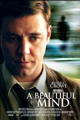
A Beautiful Mind: 2002


***

Chicago: 2003


***

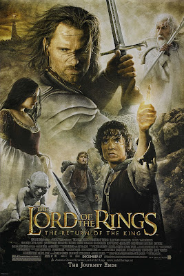
The Lord of the Rings: The Return of the King: 2004


***

Million Dollar Baby: 2005


***

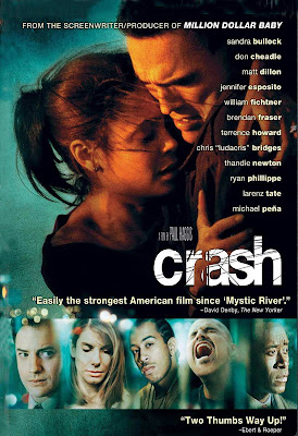
Crash: 2006


***

The Departed: 2007


***

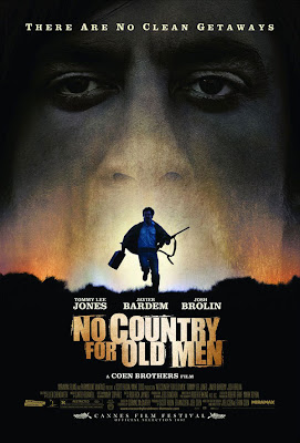
No Country For Old Men: 2008


***

Slumdog Millionaire: 2009

***

What do these films have in common?

American Beauty: A man narrates the film, has a midlife crisis, and attempts to seduce and/or rape a potentially underage high school student.

Gladiator: A man in captivity avenges the murder of his wife and son by murdering their murderer.

A Beautiful Mind: A man at the height of his genius suffers from schizophrenia.

Chicago: A singing and dancing man attempts to save singing and dancing female inmates from death row.

The Lord of the Rings: Men go on a quest.

Million Dollar Baby: A man narrates the film, telling the story of his friend’s attempt to train and manage a determined female boxer.

Crash: A cast of characters—male and female—illustrates our society’s inability to distinguish between racism and prejudice.

The Departed: Men violently kill one another.

No Country For Old Men: A hired hitman goes on a killing spree with a captive bolt pistol.

Slumdog Millionaire: A man participates in a televised game-show, thinking it will help him find his long-lost love.

***

I’m interested to see how the 2010 Academy Awards Ceremony will choose to honor this year’s films, especially now that they’ve bumped up the number of Best Picture nominees to ten instead of five. With the amount of women-centered and/or directed films this year—Julie & Julia, Precious: Based on the Novel Push by Sapphire, Bright Star, Amelia, and The Hurt Locker, to name a few—I hope women will feel some of the Academy love. Don’t forget to check back in February for analysis of the ten Best Picture nominees!