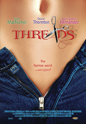
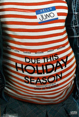
As if reducing women to a collection of nothing more than unrealistically portrayed body parts weren’t enough, the accompanying taglines of these particular film posters also caught my attention.
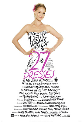
The Women and 27 Dresses don’t use a catchy tagline on the posters shown below. Maybe the designers of the posters felt that random words shaped into a woman’s torso would suffice, considering these two films exclusively target women audiences. And what do audiences comprised of women want to see in The Women? Nouns, apparently: Bonding Joy Jealous Kids Tears Struggles Laughter Thighs Balance Intuition Fighters Passion Elegance Shoes …
With the 27 Dresses poster, what else could we possibly need? She’s already been made into a fucking dress. (Get it? The movie is called 27 Dresses, so Katherine Heigl’s body is like totally a dress. Neat! Way to objectify a woman by turning her into an actual object.)
The other two posters depicting a pregnant woman each emphasize two men, the first one showing two men in a photo, and the other showing two men smiling ridiculously while cradling the woman’s stomach. Also note the … what, shaving cream smiley face? … painted on her stomach.
Then the taglines.
In Misconceptions, we get: “Good things come in other people’s packages.” Um, okay. Whose “package” are they referring to here exactly? The woman-as-baby-making-machine who will deliver a package in nine months? Or one of the two men apparently involved in providing sperm? With his … package? What the hell is happening here.
In the poster for The Brothers Solomon, they just come out and say it: “They want to put a baby in you.” Great! A film about a woman’s pregnancy that’s actually somehow about two men. Thanks, Hollywood.
The remaining posters that incorporate taglines:
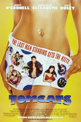
Tomcats: “The last man standing gets the kitty.”
Swimming Pool: “On the surface, all is calm.”
Threads: “The fashion world … unzipped.”
American Beauty: ” … look closer”
The Babysitters: “These girls mean business.”


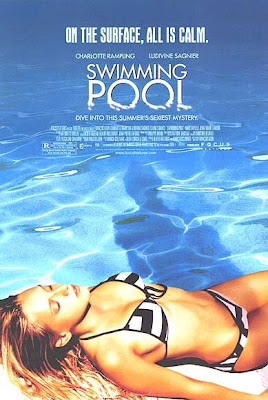
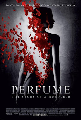





um Swimming Pool hardly constitutes disembodiment. Ludivigne Saignier is clearly recognisable and the image clearly links to the plot. Plus the gaze on her in the film is predominantly female. It just doesn’t fit with the other examples.
And Swimming Pool also isn’t a Hollywood film. If I recall correctly, about two-thirds to three-quarters of the movie features just one or two women–sans men, who appear only briefly as minor characters.
I like how you focus on the bare stomach. There is an inherant vulnerability and “serving-up” suggested in that particular gesture. In that regard, Swimming Pool, though not so much a visual amputation or erasure as the others, still reflects a vulnerability as does the shadow crossing through or over her stomach.
The purpose of this particular series of posts is to look at how films are advertised. In many cases, I haven’t seen the films and therefore can’t comment on how accurately or realistically the posters represent the plot, characters, central conflicts, etc., of the films themselves. By looking at the poster, I can, however, analyze how a film is sold to the public.
In the Swimming Pool poster, I can clearly see that a woman’s bikini-clad torso was chosen as the main vehicle to sell this film. For the record, I consider a poster that shows only parts of a woman’s body, rather than her entire body, to be an obvious example of dismemberment. In this case, the woman’s legs are cut off.
I’m also not interested in whether I recognize the actor/s in the poster. It makes about as much difference to me as whether I can identify Kate Moss as the dismembered model in a perfume ad. Both the perfume ad and the film poster ultimately serve the same purpose: to get people to buy their product.
In the Swimming Pool poster, the advertisers advise us to “dive into this summer’s sexiest mystery.” Apparently, this summer’s sexiest mystery involves a swimming pool and a woman (unknowingly?) being watched by an unidentifiable, slightly stalkerish-looking shadowy figure.
So we’ve got the following: the word “sexiest” on the actual poster, right above a dismembered, bikini-clad woman’s airbrushed torso, and a shadow of a person hovering over her. Mysterious! Sexy! Hmmm.
I get what you mean Stephanie. I don’t necessarily enjoy seeing images where women are unneccesariily provocative.
I just think there is a big difference between pictures that show just one part of a woman’s body, those that don’t show her face and those that are using the sex appeal of an actress as a whole. I don’t agree that if *any* part of someones body isn’t shown then it is disembodiment; loads of posters picture the actors from the waist up.
But obviously my knowledge of the film affects how I see the poster. I didn’t register the tagline (it was different in the UK I think when I bought the DVD) Plus I know that the shadow is Charlotte Rampling and that the ‘mystery’ doesn’t involve any murder or attack upon the girl on the poster as is implied. But you’re right of course that the whole package (without knowledge of the film) adds up to dodgy.
But anyway, several of the others are much worse: The Brothers Solomon poster just makes me want to vomit.
Ugh, The Brothers Solomon is just No. And I also particularly *hate* the Tomcats poster.
I know you’ve commented in the past about some of the differences in the way films are advertised in the UK versus how they’re advertised in the US. It would be an interesting post to look at those differences …